Janet Perr

Go Big or Go Bust: Day 235 (on our photo shoot with Everett Quinton, Jay Patterson, Janet Perr, Larry Bercow and Nika De Carlo)

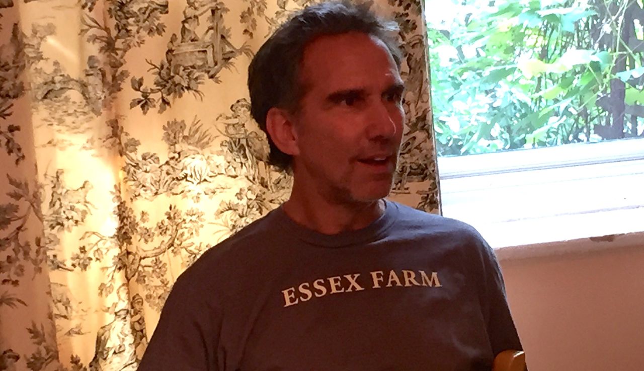
We did a promotional photo shoot today with a group so creative, so focused on the work and so completely unhinged that when Mr. Green stopped in to make himself a quick sandwich, he feared a fist fight was about to break out in the living room.  The effort was to further the 'Go Big or Go Bust' agenda and I am blasted with tiredness.  Here are some shots from lunch:

L to R the incomparable Jay Patterson, the man of the hour Everett Quinton and the lovely triple threat Nika De Carlo

L to R the incomparable Jay Patterson, the man of the hour Everett Quinton and the lovely triple threat Nika De Carlo

Ironic (or tricky) that the super talented and very generous photographer Larry Bercow was sitting in a way that I couldn't get a good picture of him. 

Ironic (or tricky) that the super talented and very generous photographer Larry Bercow was sitting in a way that I couldn't get a good picture of him. 

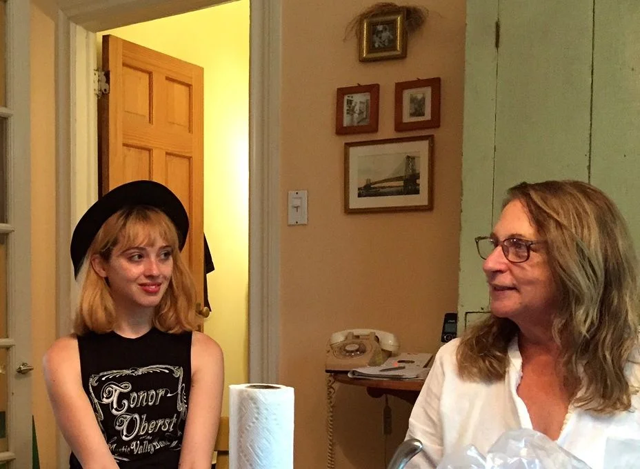
L to R Nika De Carlo with the legendary Art Director Janet Perr whose album package for Cyndi Lauper's 'GIrls Just Wanna Have Fun' won a Grammy.

L to R Nika De Carlo with the legendary Art Director Janet Perr whose album package for Cyndi Lauper's 'GIrls Just Wanna Have Fun' won a Grammy.

Then, like normal people taking care of themselves (not), Mr. Green and I jumped in the car and fought our way through bumper to bumper traffic all the way up to the George Washington Bridge.  Just for fun, we continued north for another four hours.  But who's counting. 
Go Big or Go Bust: Day 230 (Janet Perr, designer of Cyndi Lauper's first album cover, and new video thumbnails)

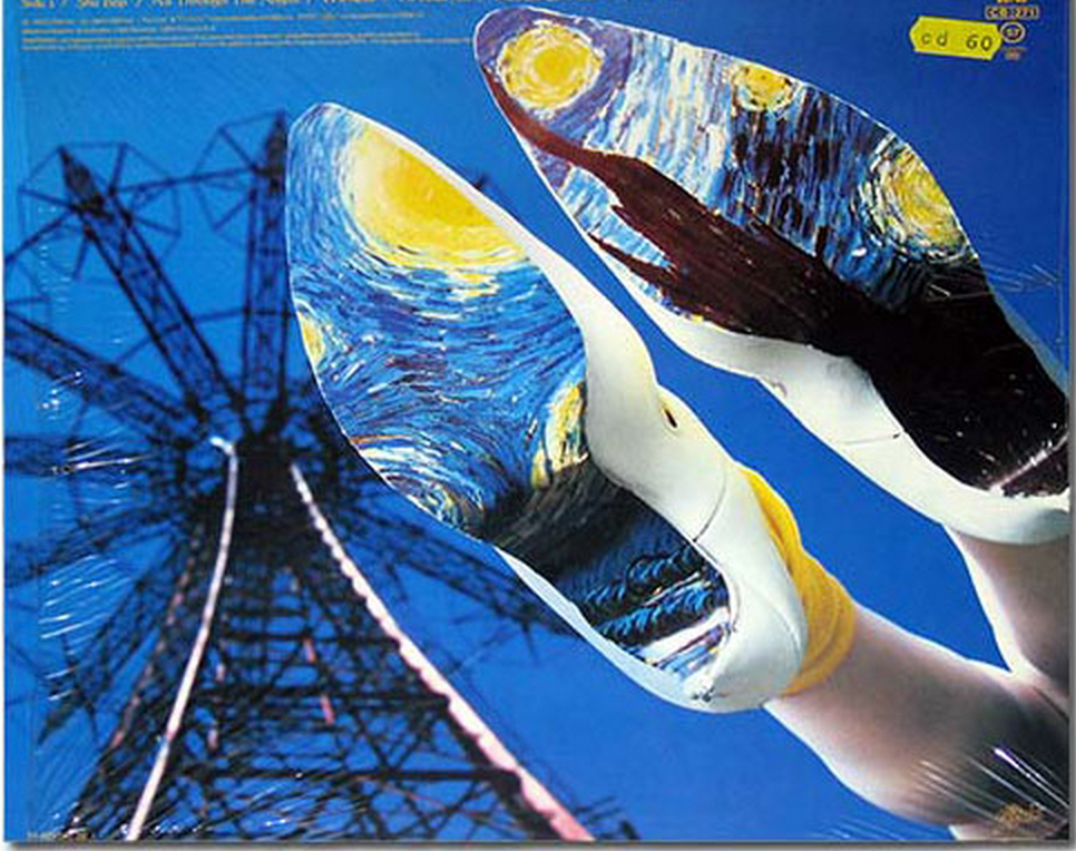
Today I spent a couple of hours walking by the Hudson with Janet Perr, a friend from the (sometimes dark and lonely) days when our kids were in Kindergarten together.  Who knew that old Janet had had designed an album cover one for the Rolling Stones, that amazing cover for Cyndi Lauper's first (incredible) album and that Janet even won a Grammy for album cover design!

Oddly enough, I'm up to my neck in my own design project.  Using everything Mhairi told me to do plus whatever I've been able to learn from studying popular web series thumbnails (the tiny posters for videos online are called 'thumbnails') I'm in the midst of redoing all the thumbnails for all three seasons.  Whaddaya think?  (I'm seriously open to comment and suggestions.)